Quick free world maps using GIMP filters and Donjon fractal maps series:
Part 1: Getting a fractal map,
Part 2: Getting different types of maps,
Part 3: More accurate 3D maps with mountains,
Part 4: Zooming and resolution,
Part 5 Expanding the Zoom Limits.
Available from Google Play Books and RPGNow.
https://play.google.com/store/books/details/Ken_N_Wickham_Quick_free_world_maps_using_GIMP_fil?id=tvZmDAAAQBAJ
Also available on Kindle
https://www.amazon.com/Quick-world-filters-Donjon-fractal-ebook/dp/B01H131XPY/
http://www.rpgnow.com/product/187006/Quick-free-world-maps-using-GIMP-filters-and-Donjon-fractal-maps
Zooming and Resolution
This full world map of Aioskoru shows the outline of the mountainous region that I wanted to test methods out on. I really wanted to find a method to quickly generate topographical maps showing contour lines, especially if I could do so at a more finely detailed resolution.I show the series of attempts, failures, and breakthroughs that increased my knowledge of methods of map information extraction digital methods using fractal maps.
This next picture is the Plain Color Atlas zoomed image of area. The other images following will be of this same region. You can compare each of the methods results to each other. In this picture the whiter areas are snowcapped peaks.The browns are the regular mountains. The other areas are valleys.
This was one of my first attempts at trying to modify and bring out more information from the picture. The result added structure, but wasn't very good nor accurate.
Here is the default Icon of the region. Certainly the icons are symbolic on a grand scale and not so accurate on a closer or fine detail sense.
In this view, I used the icon pack to modify several of the mountains into the snowcapped peak icon. I also tried to stack the grid on top of the first modification of the map. For a time, this became my most accurate map. It still is my main hex map.
This was the result of my first attempt at a topographical map with contour lines. The fractal is very obvious and unusable, but I realized that this meant something. if only I could harness this information better.
I then found this method to separate the layers of the mountains. This method became what I call the Layered Method. I had actually tried to use the color selector to make this similar type of map, before finding this quicker one step method. That other method took 5 minutes to select each of the different color ranges in the entire map. Even then, I missed some. This one step method is better and very easy.
With the Bump tool, this became my first 3D map using the Layer map. I quickly realized that the mountains were depressed down rather than sticking up.
I used a select and reverse method to try pulling up the mountains. This for several months remained my best 3D map. This was going to be the method I was going to share when I wrote my first blog post, up until I found the quicker method more recently. It takes time, patience, and luck to get this type of result. Even then it is somewhat flawed.
Here is the Greyscale method that I recently found and shared. I believe it is easier and more accurate than that last complex method and doesn't have the weird indentation flaws. When combined with the Plain color map like I showed in the previous post, it gives a pretty decent and accurate map.
For a month I assumed that that method was the best that I could do for more accurate detailed information. It isn't bad. But of course I wanted more. While working with the map, I was trying to do something entirely different than typography. This emerged accidentally. It has something to do with that black map with mutliple color lines.
When I looked at it closely, I realized that it shows topographical lines showing changes in elevation at a more finely resolution. And I thought that I could zoom in at a finer detail.
In the next post I will show a comparison of that zoomed in area.
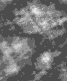
Here is a composite picture mixing the Greyscale and the Topographical Contour Line method maps. I noticed that I could see smaller hills and valleys easier. Elevations changes that did not even show up on the 3D Grayscale Bump map indicated by a lighter or darker circles and patches of color.
At this time, I wont show that the Topographical Contour Line method. That method I may actually put in a PDF book in the future and sell for a small cost. Or I may offer that service for a fee for select regions of someone's maps, since that method took a lot of frustration, attempts, and failures. And only an accident while painstakingly working with the maps revealed it. It took so long to develop.
The next post next week, I will show the close up zoomed comparison, even more finely detailed than this one zooming in on that southern mountain range slope.


No comments:
Post a Comment